In August 2022, the FDA ruled to allow hearing aids to be sold directly to adult consumers in stores or online, without a medical exam, a prescription, or a fitting by an audiologist. This ruling was a long-sought wish of many consumers frustrated by expensive exams and devices. It paved the way for millions of Americans to access devices, once perceived as too costly, since they were not covered by basic Medicare.
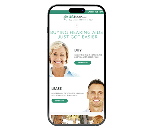
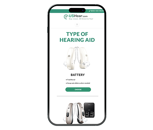
I was approached by a group of audiologists to develop a responsive e-commerce website that would allow customers to buy or lease hearing aids directly. The site would also provide information and articles about hearing loss.
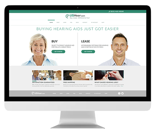
Using the design thinking process, I created a unique user experience that catered to the targeted customers' needs and enabled them to shop for hearing devices in a simple, intuitive way.
A total of 40 interviews and questionnaires were conducted to determine what were the needs, complaints, obstacles, and difficulties people had when buying and owning hearing aids. The participants were made up of 6 young adults; 2 males and 2 females, between the ages of 24-35. The next group consisted of 6 males and 6 females ranging in age from 40-55. The remaining 24 subjects consisted of 12 male seniors and 12 female seniors, ranging in age between 65-90. Both the quantitative and quantified data gathered was used to develop the architecture and user experience (UX) of the website.

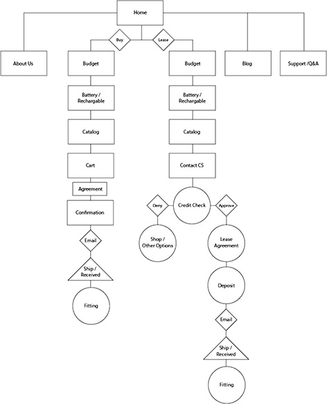
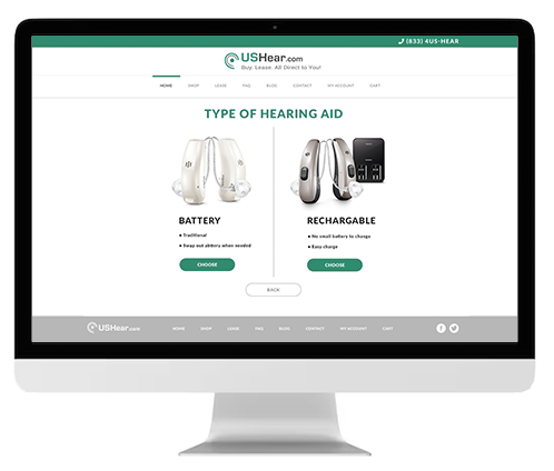
To make sure every step of the users' journey was accounted for, user flows were created. The user flows allowed me to understand how to simplify the process and provide relevant pathways and options for consumers.
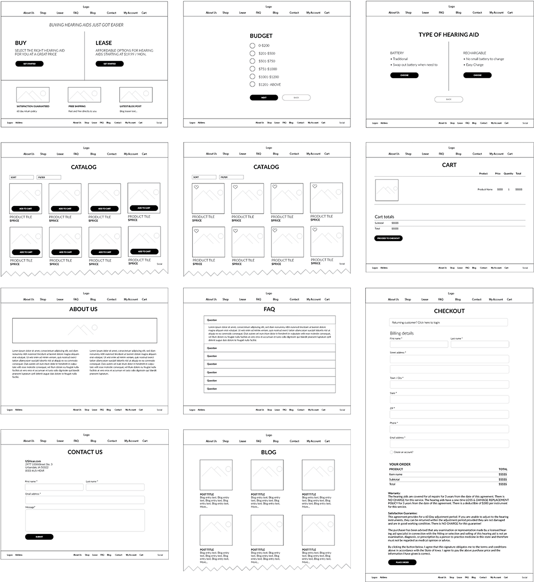
The users' needs and requirements were placed at the center of designing the site and page architecture. Clear and easy-to-navigate experiences were established through wireframes.
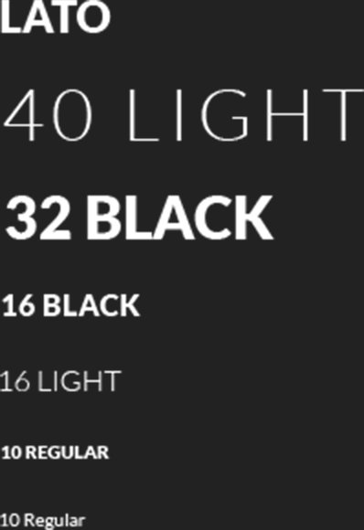
Lato was chosen as the primary typeface due to its easy-to-read design. Different font weights and sizes were used to create a clear hierarchy of information.
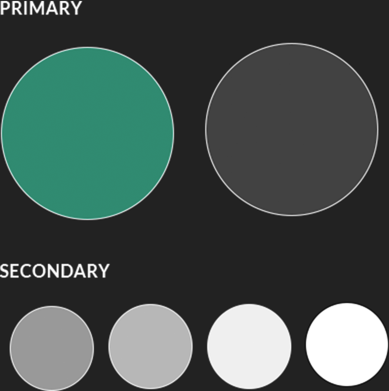
A simple color palette was chosen to maintain simplicity and clean design. The primary green was used to highlight high level elements and action items. The remaining colors created contrast that was easy to view
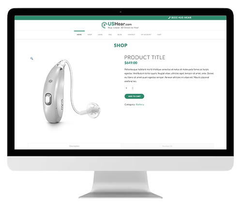
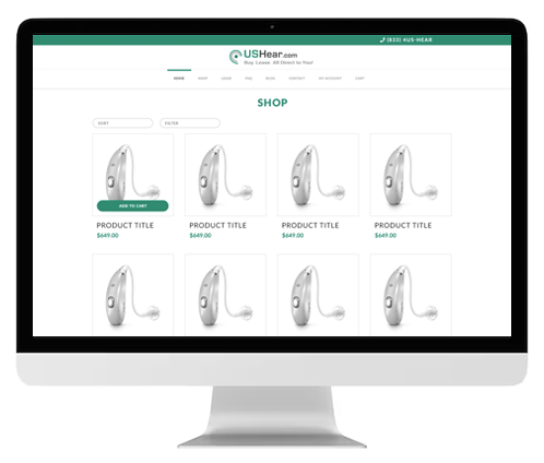
Every screen of the site was designed to include only relevant information. Consistency was maintained to provide a cohesive experience.
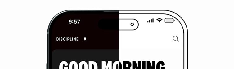
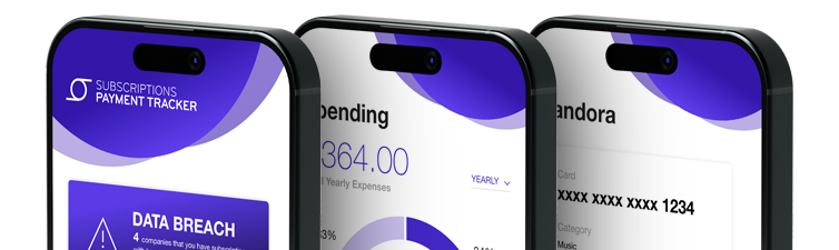
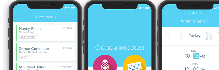
Click on the banners below to view my featured projects.
Feel free to contact me about any inqueries you may have. I look forward to hearing from you!